The Mayans were a classical civilization of Mesoamerica. Originating in the Yucatan around 2600 B.C.E., they rose to prominence around A.D.E. 250 in present-day southern Mexico, Guatemala, western Honduras, El Salvador, and northern Belize.
Spark your math thinking!
1. Set up your math mini spark recording page: #7: Mayan Math
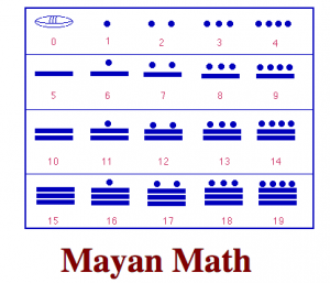
2. Mayan Math was the most sophisticated number system ever developed in the Americas. Astronomers and architects used Mayan Math, but it was also simple enough to be used by uneducated traders and farmers. Where we use ten different symbols to represent numbers (1, 2, 3, 4 , 5, 6, 7, 8, 9, 0), the Mayans used only three: a dot for a one, a bar for five, and a symbol (usually a shell) for zero. (The Maya were the first civilization to discover and understand the concept of zero.) The chart below shows the Mayan numbers 1 – 19. Draw this chart on your recording page or use this online tool to practice making the numbers 1-19.
4. The Mayans wrote their numbers from top to bottom rather than from left to right, but apart from that, their system was not so different from ours. For example, to write the number 34, we place a three in the tens column and a four in the ones column. The Maya put a one in the twenties column and a fourteen in the ones column. Draw this image on your recording sheet.

5. Practice making larger numbers at Round 2 at Mayan Math Games. Then you will move to Round 3 at Mayan Math Games where you make numbers in the base 20 system. If you think you can move to round 3 without starting in round 2 that is ok. Add a note to your recording page about what you learned.
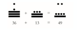
6. Adding in the Mayan system is simply a matter of juggling the dots and bars. To calculate 36 + 13, for example, you start by adding the units (i.e., 16 + 13). This gives you 29, so you leave 9 in the ones column and carry the 20 up, giving you a grand total of 2 twenties and 9 ones = 49.
Pretty smart, right? Especially, when you consider that the Ancient Egyptians never cracked the concept of zero and that complex calculations with Roman numerals were way too complicated for ordinary Romans. Practice adding in Round 4 at Mayan Math Games.
7. Optional: If you would like to try subtraction go to Round 5 at Mayan Math Games.
8. Share your math mini spark recording page with your teacher/EY coordinator.
Check out the ancient number systems badge at the EY website







 What arcade games can you make out of cardboard?

 Here are some resources to get you thinking about Science, Technology, Engineering, Art and Math as they relate to Paper Airplanes!
 Learn more about how to add spark to your writing.